TIMELINE
2 months
ROLE & SKILLS
information architecture ; content & design strategy ; cross-functional collaboration
PARTNERS
1 product designer ; 1 product manager ; 1 brand writer ; 1 product marketing manager ; 3 engineers
GOFUNDME
A home page redesign that better sets expectations for organizers’ fundraising journeys & a search redesign that tailors fundraiser results for donors.
Home page
Our Goal
HOME PAGE
How might we better support organizers coming to GoFundMe to understand how it works and why it’s the best fundraising platform for them?
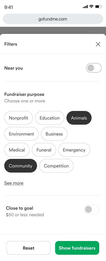
SEARCH
How might we support the “philanthropist” GoFundMe persona looking to make a quick impact by allowing them to easily filter and find the right fundraiser/s to donate to based on what they care about?
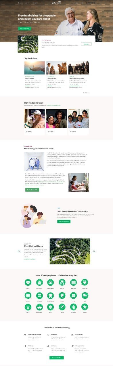
Previous home page
The Approach
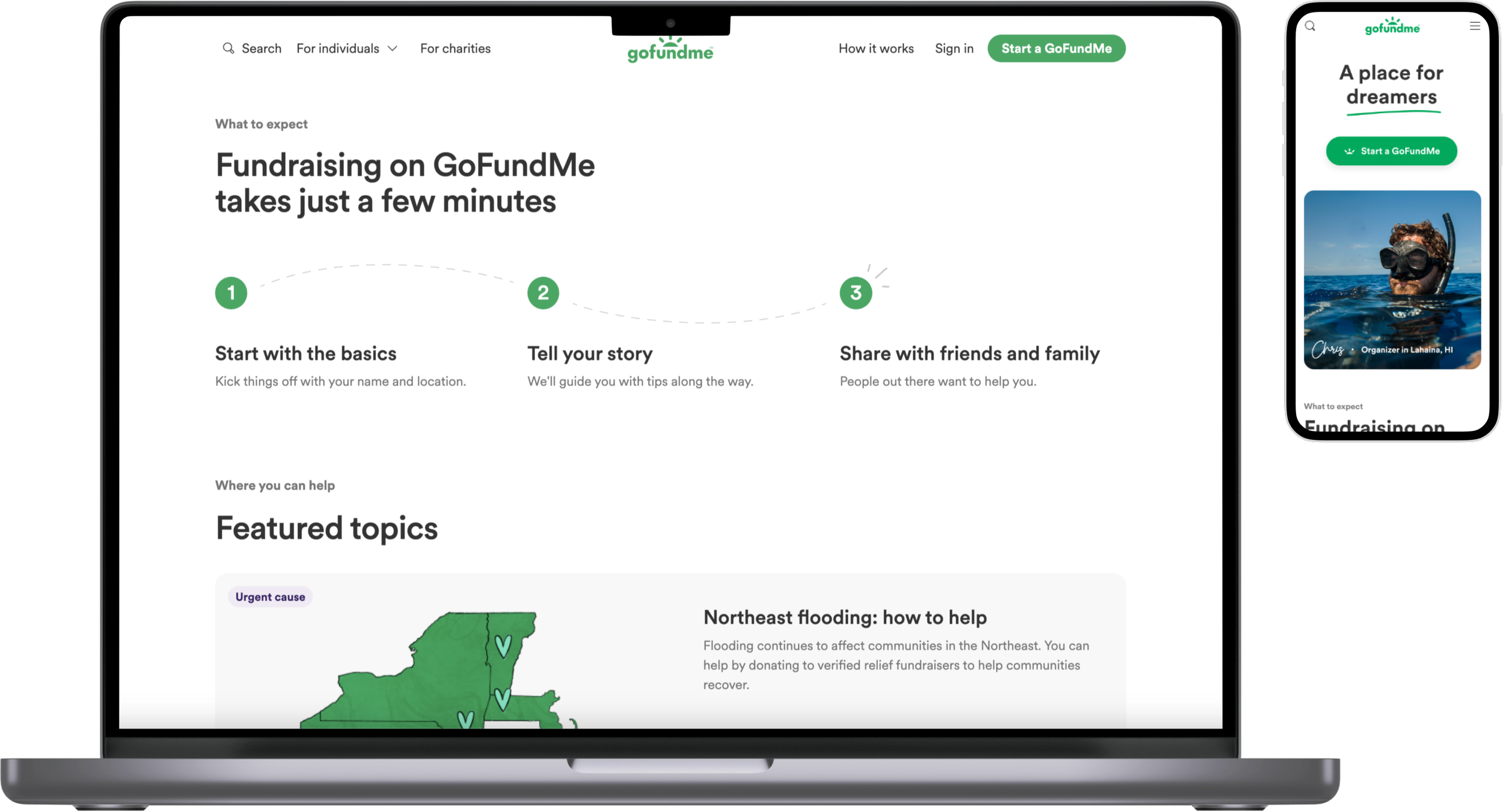
Align with our new design system and visual standards.
Show the breadth of fundraising people are able to do on GoFundMe—from needs to dreams.
Humanize organizers we’ve seen and bring them to the forefront of the experience.
Set expectations for what happens next after they click that “Start a GoFundMe” button—we’ve heard in user research that what to expect is especially unclear for organizers.
Process
For home page, I created a value prop breakdown that informed our final direction for home page. The hierarchy took into account balancing marketing/business needs with user needs.

In partnership with brand and product marketing, we put together four rotating personas that highlighted breadth of GoFundMe fundraising.


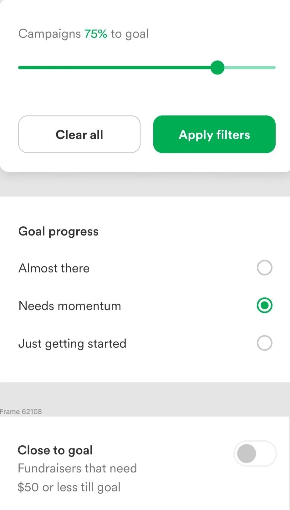
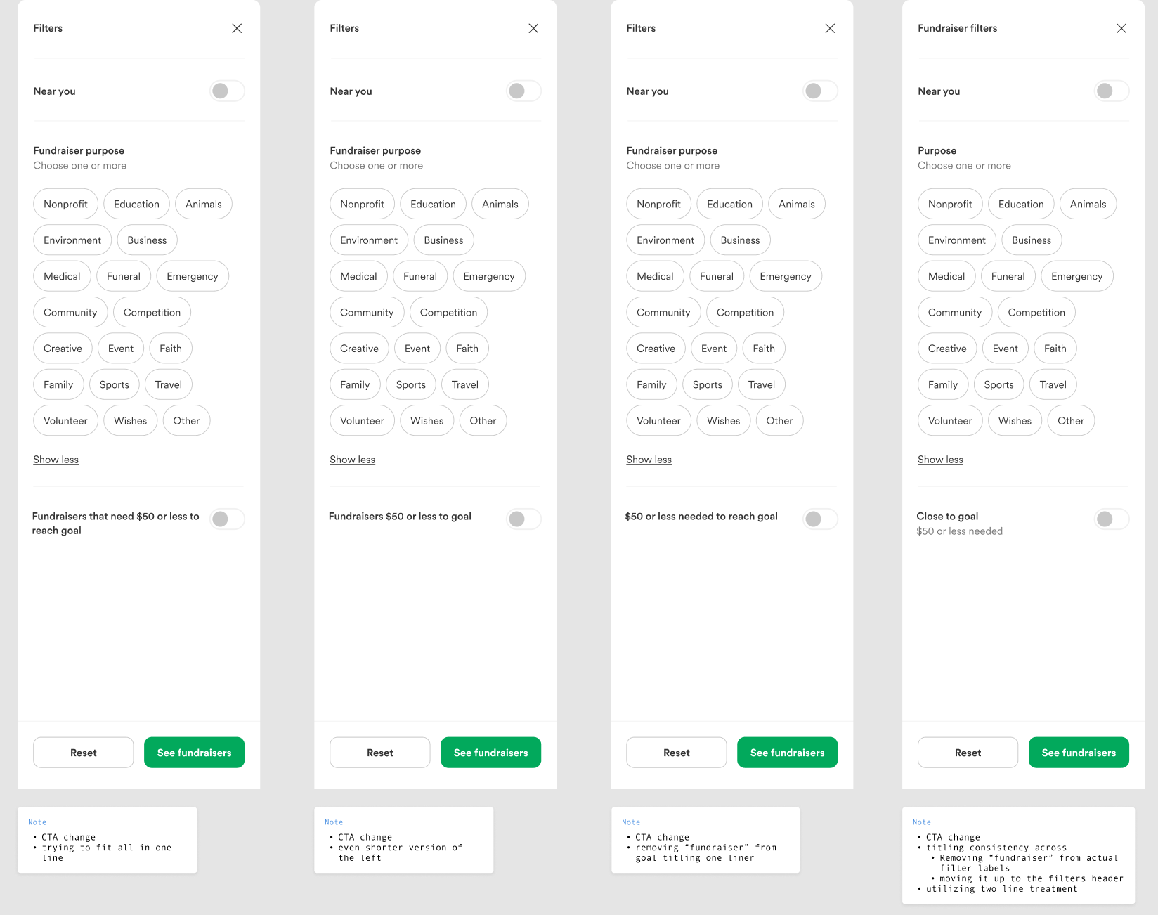
For search, we decided that the most important criteria in search filtering was location, fundraiser type or purpose, and progress to goal.
We explored a few interaction variations for filtering by goal progress including a slider, radio buttons, and a toggle.
After deciding the toggle was most effective and easy, I explored a few toggle content options and their pros and cons.
Outputs
Home page


Search
Results
After running an A/B test on the home page for some time, we fully launched the redesign to 100% because of significant improvements to accessibility and page load times.
We then took another look to address a couple issues.
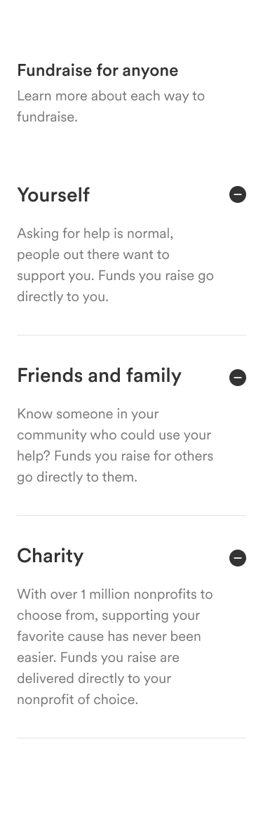
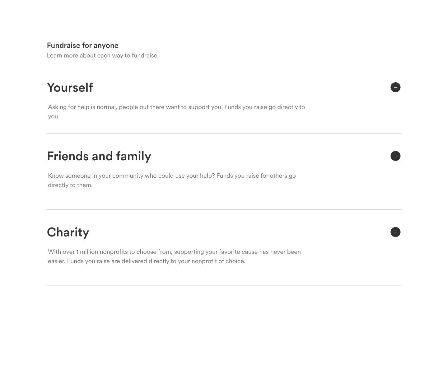
The “Fundraise for” section was linking people directly into the create flow which people were confused by. People were expecting to see more information so we repurposed that section to include:
Reassuring messaging around why fundraising for each entity is helpful
Where the funds would go in each scenario
So we opted for an accordion style for each fundraising option with more of that information.

Before

After