TIMELINE
3-week design sprint
ROLE & SKILLS
information architecture ; journey mapping ; content strategy ; end to end copy
PARTNERS
4 product designers ; 1 content designer ; 1 product manager ; 4 engineers
GOFUNDME
The first tone-tailored create fundraiser flow for organizers fundraising for funerals or memorials, built to scale other fundraiser categories, and featured on FastCompany.
Create a fundraiser
Our Goal
GoFundMe organizers can fundraise for 20 categories worth of causes, but their experience creating a fundraiser is uniform. We sought to better tailor and support our organizers who most frequently fundraise on GoFundMe–those going through grief and raising funds for funerals or memorials. While we went through design phases thinking about an organizers’ journey end-to-end, we ultimately focused on their experience creating a fundraiser and their fundraiser page.
Funerals & memorials by the numbers
20% of all fundraisers created
25% of GDV (gross donation volume) in 2021
75% raise over $3K
12 days to reach goal
The Approach
Improve the experience by…
tailoring
adding more clarity
removing frictionImprove funeral and memorial fundraiser outcomes by…
increasing fundraiser publish conversions
increasing amount of donations organizers receive
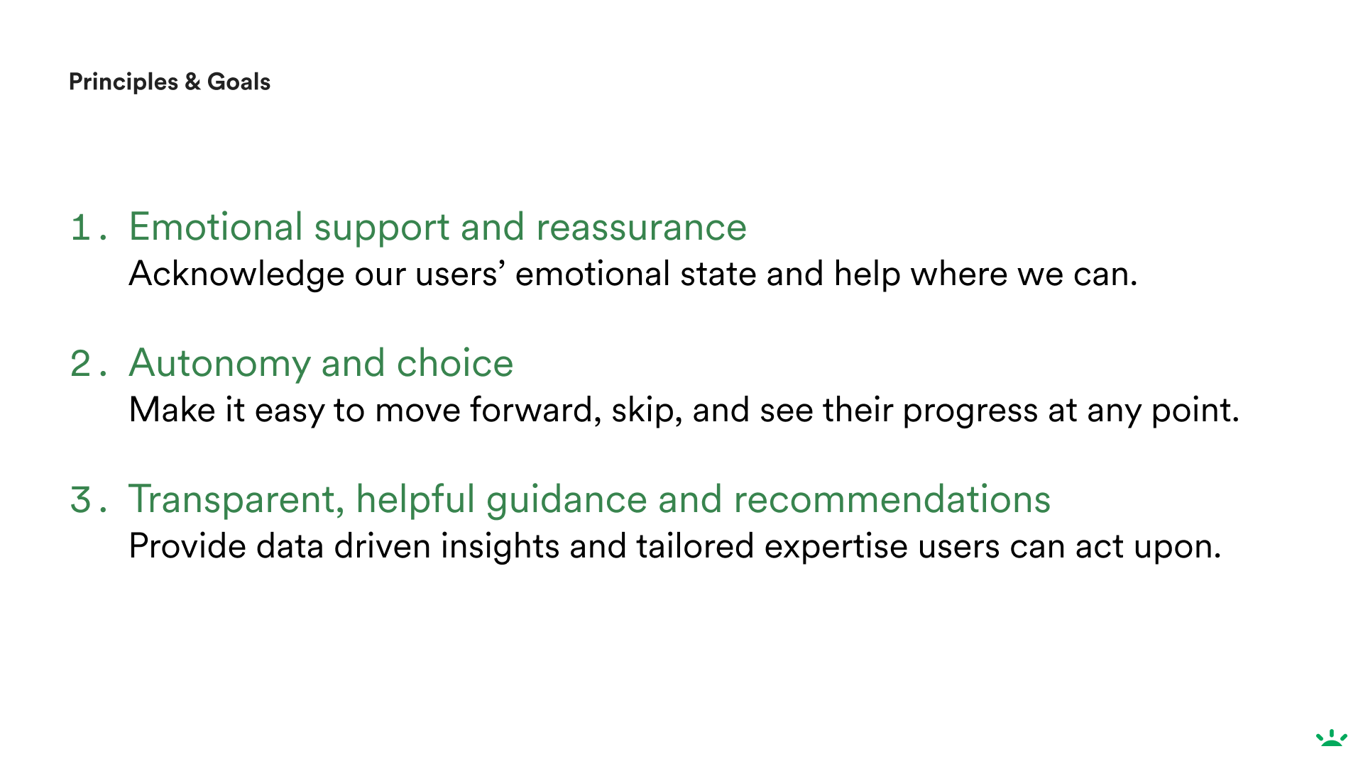
Design principles I created for team guidance
Process
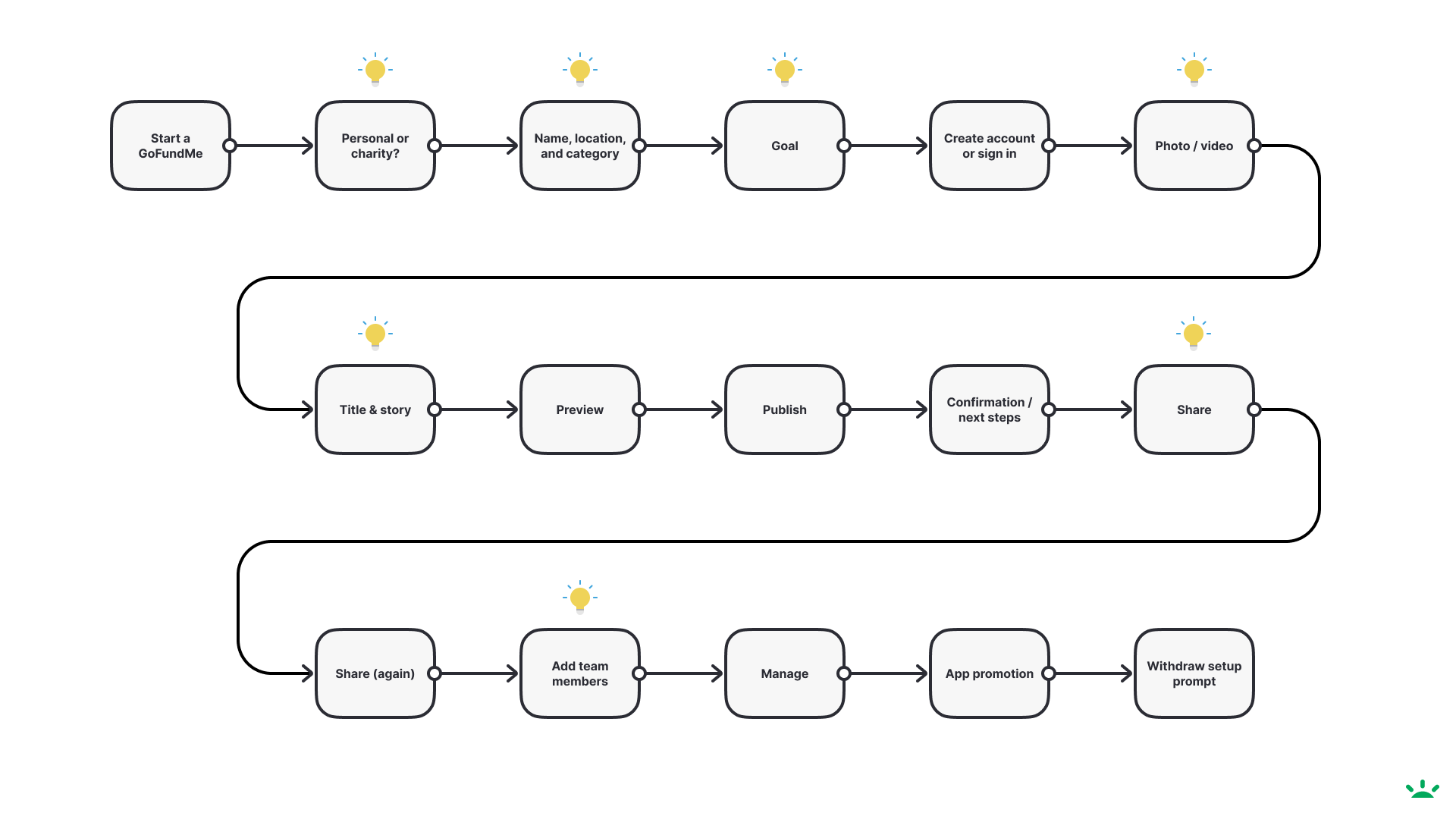
We started by taking a look at our current user journey throughout the fundraising experience and identifying opportunities for interactions, visual design, and content. This helped us narrow in on the areas we wanted to focus on and re-structure as well as mapping out associated user emotions and decisions that need to be made at every step.
I created prose influenced by our resources on funeral and memorial fundraisers I collected, VIP team’s knowledge, and funeral fundraising competitors. This prose influenced our proposed new flow structure and order, hierarchy, and set the tone for the flow’s eventual final content, look and feel. I also created a source of truth copy doc and worked with product management, design, and engineering to phase out the releases of our changes.
The main iterations and explorations we made were in:
Overall order and tone of flow
Fundraiser category selection
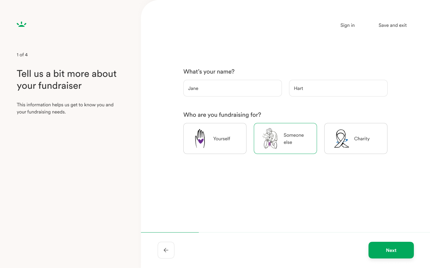
Who you were fundraising for
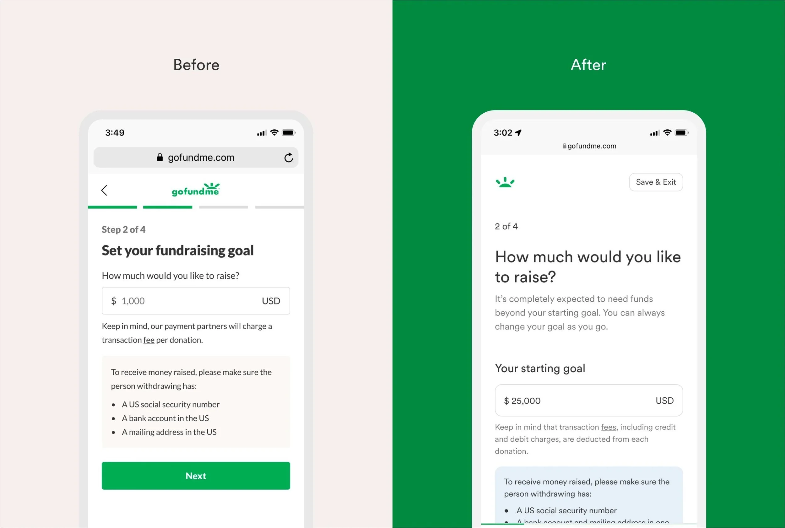
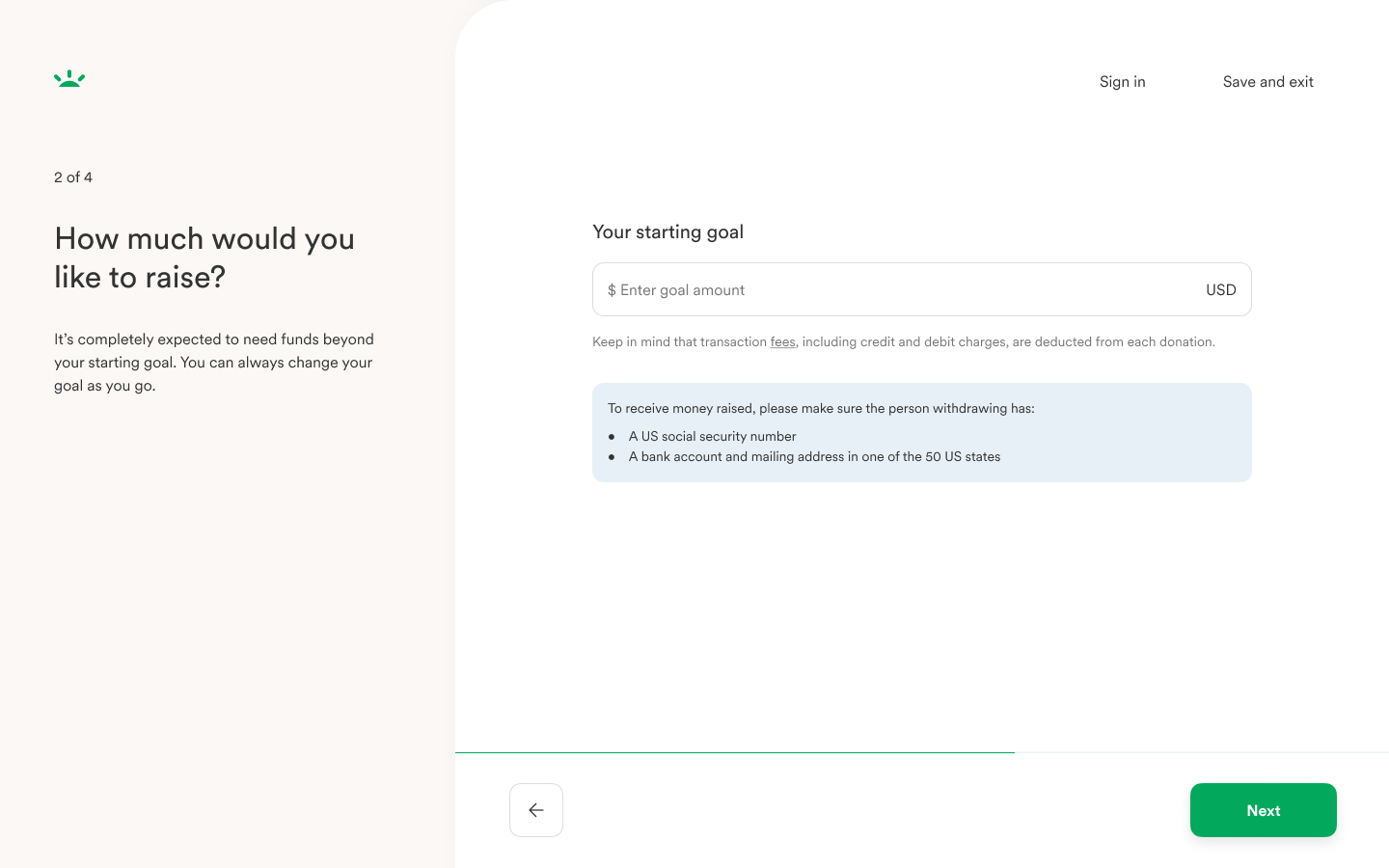
Goal setting
Media selection
Story writing
Outputs
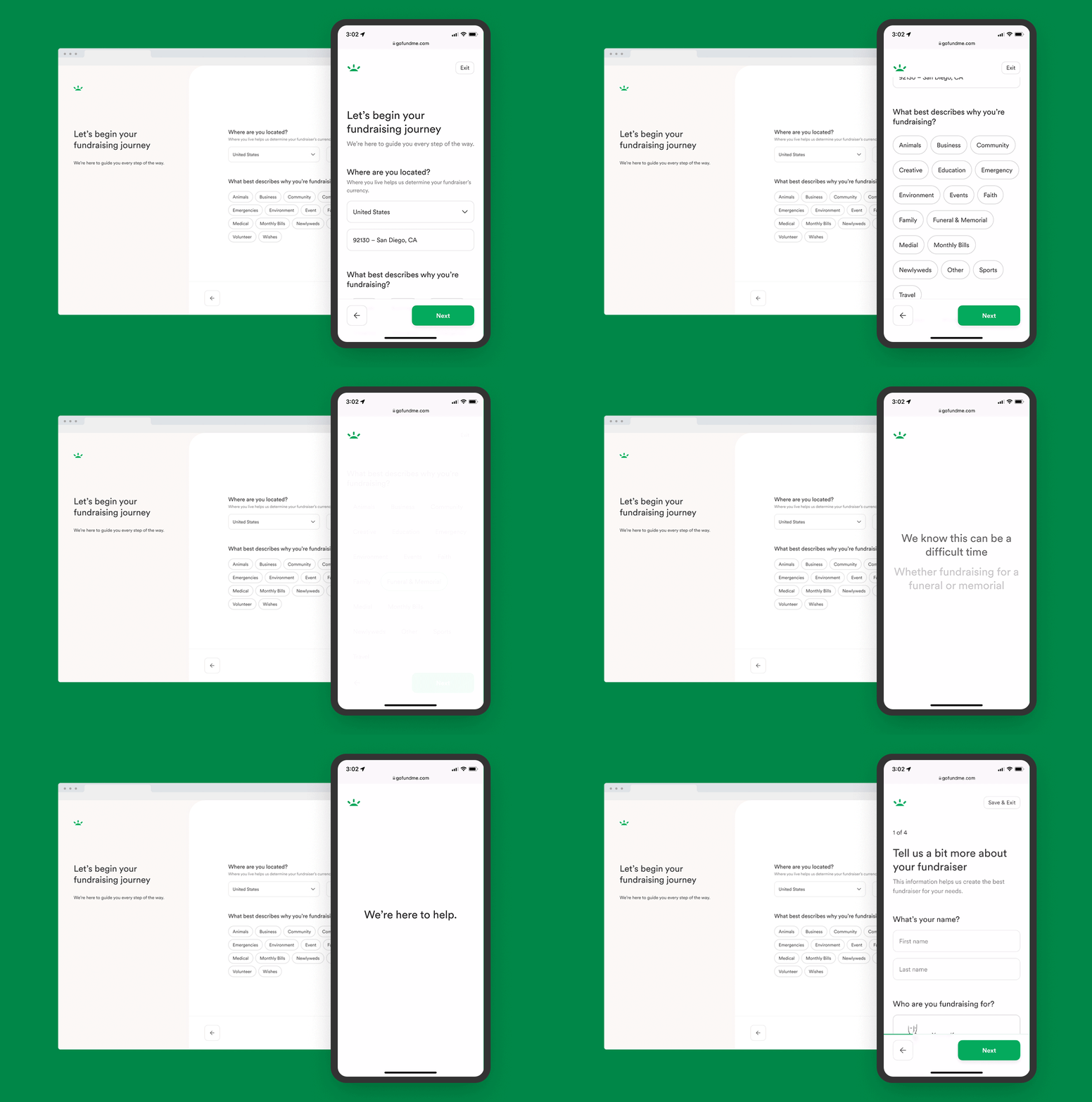
Some highlights of the new experience
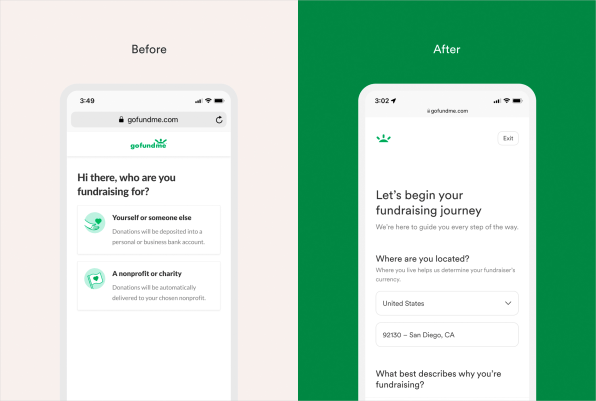
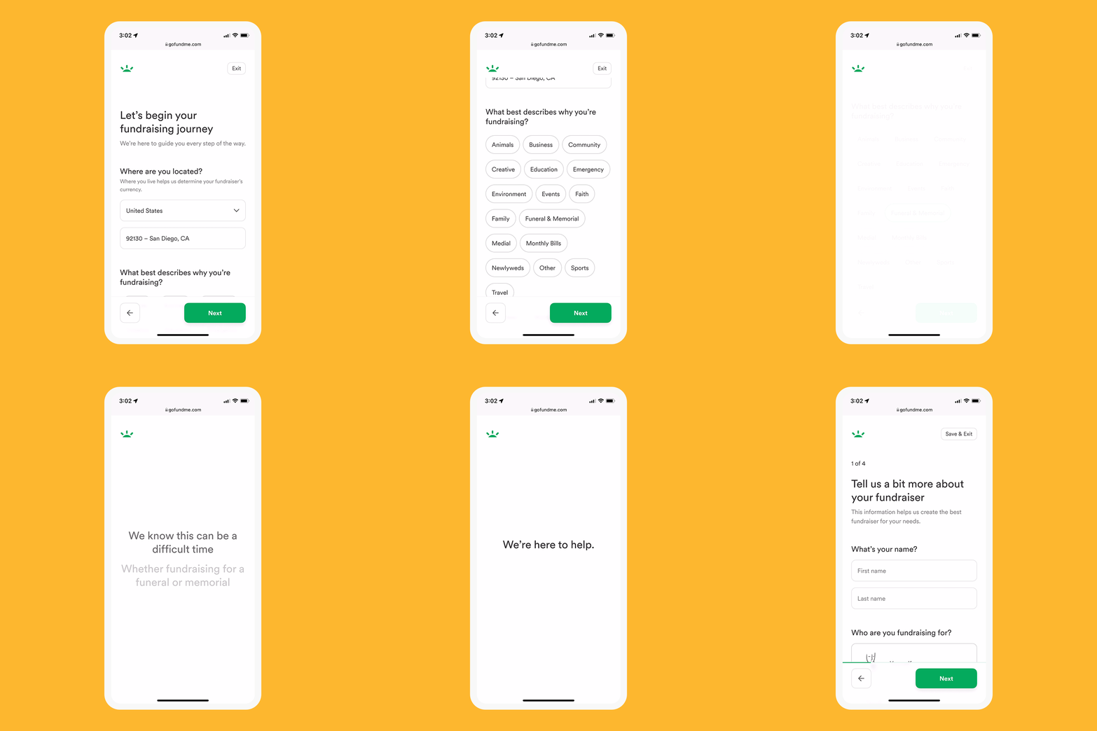
Shift in order
Instead of asking organizers in the very first interaction who would manage funds, which could be overwhelming during emotional turmoil, we surfaced simpler questions at the beginning of the flow.
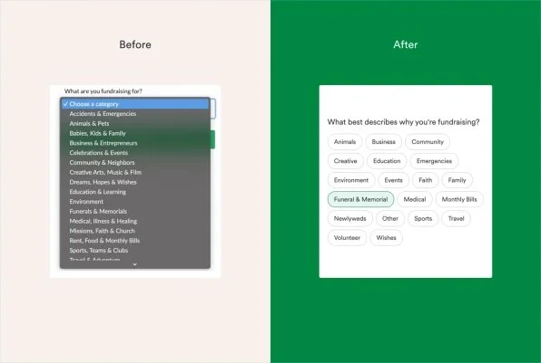
Category redesign
We lowered cognitive load by removing the dropdown menu and simplifying categories. In testing, we found 60% of respondents preferred the redesign of categories vs 40% for the dropdown design. 68% of respondents preferred the alphabetical order of categories.
More empathetic tone
Switching commanding statements to questions where it made sense to create a less transactional tone.
Funeral service date
We incorporated a funeral service date feature so organizers can more easily share timeline and inspire more trust amongst donors who can also understand urgency of funds needed.
Empathy takeover
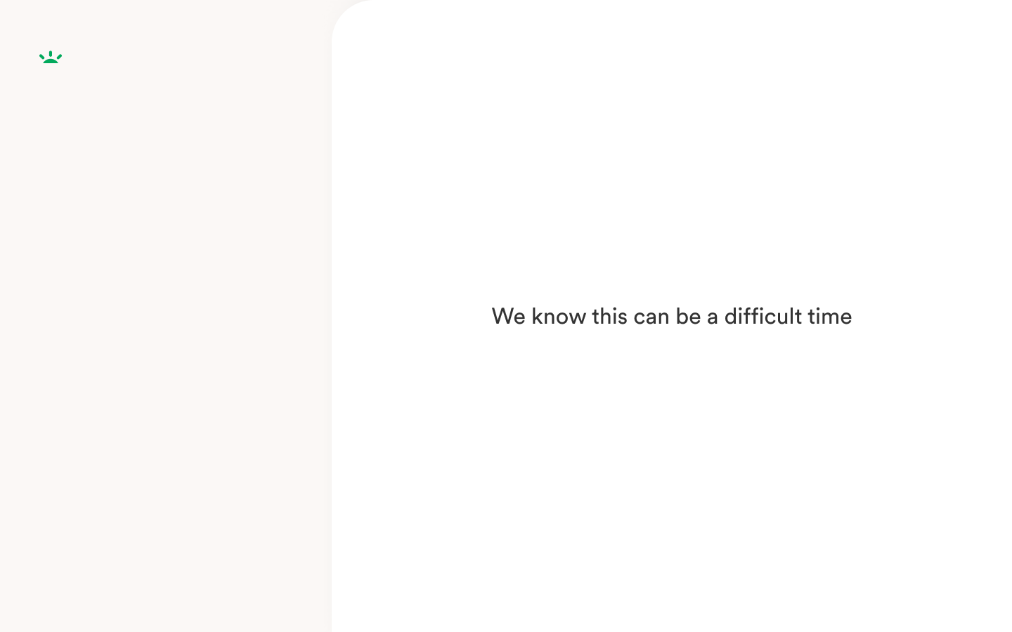
We used a series of three messages to acknowledge what organizers were going through as well as make the experience feel more conversational.
Results
We were able to run a research study with 55 participants on our redesigns where we received mostly positive feedback. Read the full report
I helped ghost write our Medium article about the launch of our tailored flow which led to a feature on FastCompany.
When the Ukraine crisis struck, we were able to use this redesign to scale and create custom messaging plus extra guidance on how to expedite a Trust & Safety review on their fundraisers where I partnered closely with the Trust & Safety team.
Below is a snapshot of the custom Ukraine crisis category screens.

